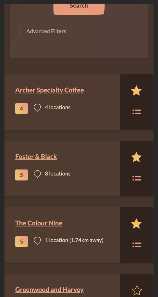
The search listings was a bit bulky, here’s a before and after of the thinning.

Development blog for HadCoffee.com
The search listings was a bit bulky, here’s a before and after of the thinning.
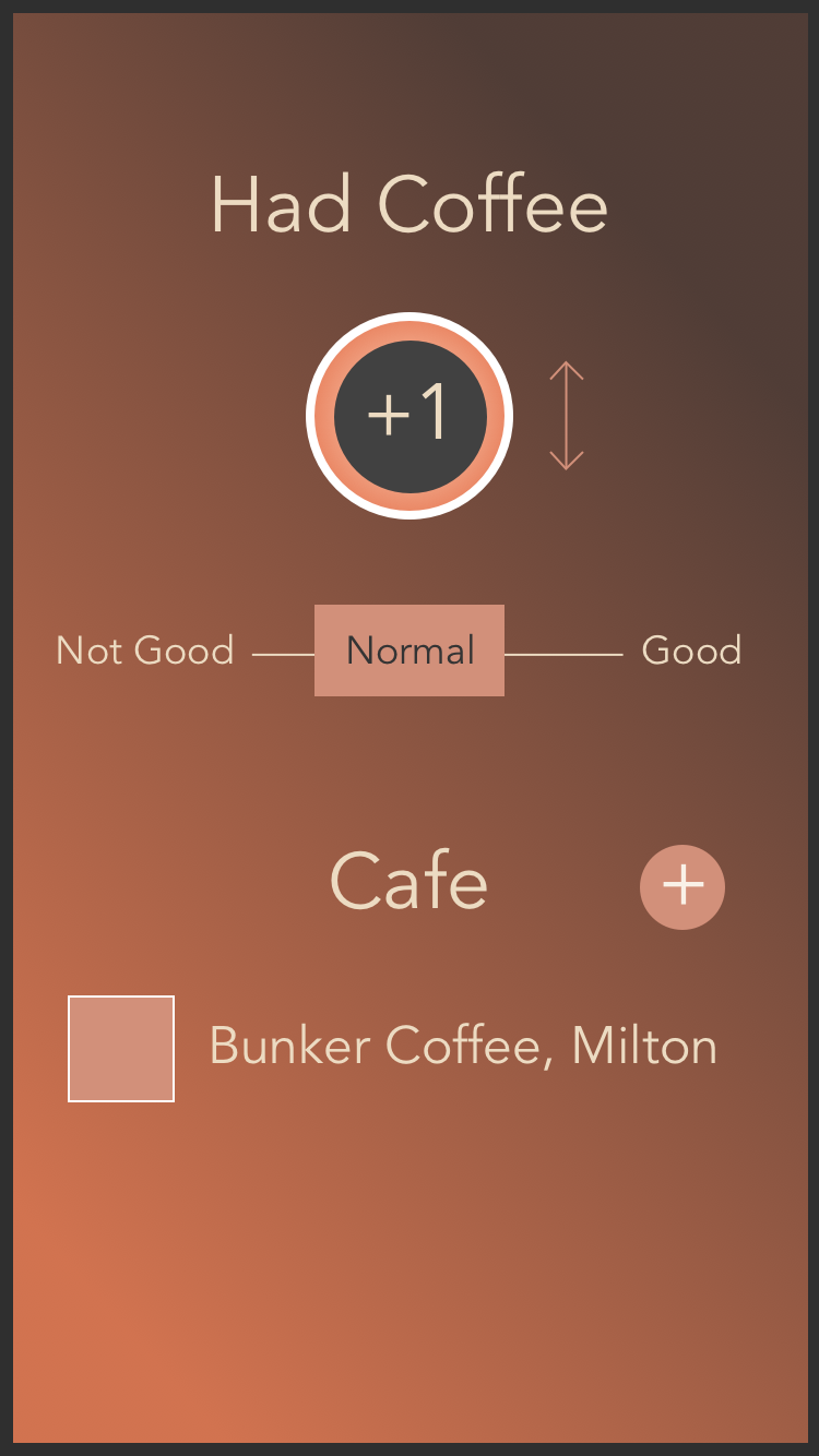
Not all cafes will make white, espresso or filter coffees equally, or equally well. Some might have a focus on espresso and bit a little average for the whites, or vice versa. Rather than combining all their ratings and losing that granularity I will let users specify what sort of drink they had when rating a coffee.
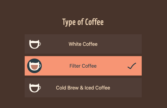
I think this will be important to help give better recommendations. A cafe might do stellar cappuccinos, but if they’re ordinary at a Long Black and that’s what you’re going to order the Cap won’t help you!
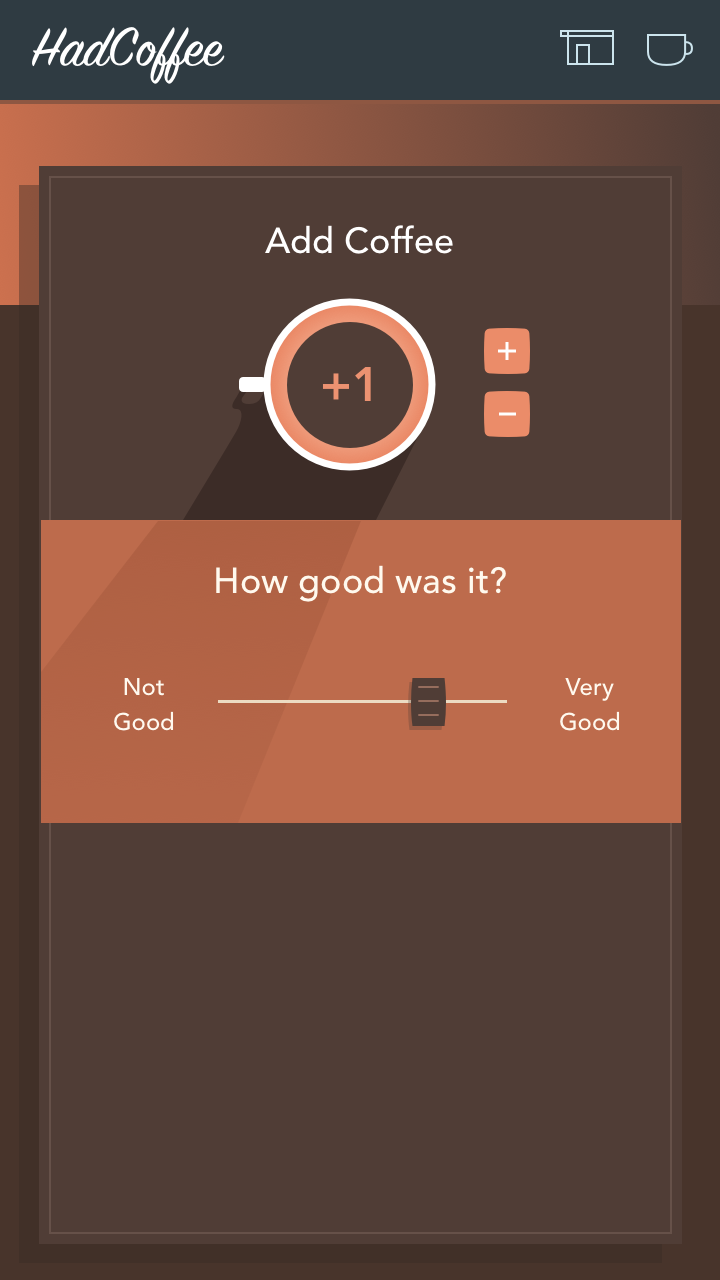
The feature does add quite a bit of complexity to the development though. I need to start tracking ratings separately for the drink categories, as well as in aggregate. The scoring algorithm will also ideally weight itself towards a users history and preferences too.
It also has frontend implications with extra UI, state management and icon design requirements. The image above is still, but I am working on building subtly animated SVG icons for the drink types to enhance the UX of choosing them. I’ve got a nice little stepped animation to show the selection action.
I love the flexibility of images-as-code and being able to add simple animation effects with CSS. I am a little concerned that bundling the SVG icons into Vue components will be adding more weight to the final JS build.
I think referencing a static SVG as an image will prevent me from being able to style and animate individual shapes with CSS. It needs to be an embedded object. When I’m already deep in a Vue component structure that means the icon also needs to be a Vue component (as opposed to server side injected SVG code).
In my defence though, I think most of the audience who are into visiting specialty coffee cafes for entertainment probably err towards having high end phones that are capable of dealing with the load. The JS will be cacheable and probably even service worker cached in the future, so it’s more a CPU/parsing issue.
Most of the backend adaptations are still to be done though, and the actual search weighting will happen later as I build that feature.
The growing amount of data stored for a rated coffee would get difficult to manage within a single parent component. I’m glad I’ve started the work of using Vuex to control the global state. Passing this many props and events up and down the component chain would be quite messy.
So much of the project framework is complete, but there are a few key features left to build.
Photos – I’ve started to think they could be important for helping a user know if a cafe has the vibe they’re after. Implementing them does open a whole new bag of onions with regards to uploading, deleting, featuring, moderating, offloading, resizing and such.

I’m not sure if that should end up in the v1 release or if I’m just blowing up the scope unnecessarily. I’m not trying to be Instagram, but at the same time photos do tell a story of what the place is like.
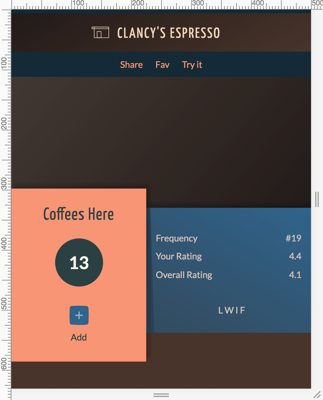 The HTML/CSS for a cafe view in the frontend are coming along. The placeholder data and characters need to be replaced with real components, but I do have the offset height panels and slanted shadow that I was after.
Seeya flat design, it’s been nice, but I need a break for a while.
I’ve done some work on an SVG icon system using symbols for reusable, editable icon versions. This will work well for static icons. For basic animation I’ll be able to use CSS targeting SVG elements in the DOM. If I introduce any more complex SVG animations I’ll need to embed the SVG content directly in the page.
Here’s a demo of the ‘Favouriting’ UI using CSS animations to give a more interesting experience to adding a cafe to favs.
See the Pen SVG Favourite by Mike (@mike_hasarms) on CodePen.
Wow, long time no progress. Side projects am I right?
I’m thinking now that the coffee logging and cafe ratings features will probably be secondary to being able to actually find new cafes you want to try. I think fewer people will care about having their personal coffee history available to them than actually being able to find somewhere good to go.
Because of that I didn’t previously have a good ‘home’ screen that leant itself to this usage.
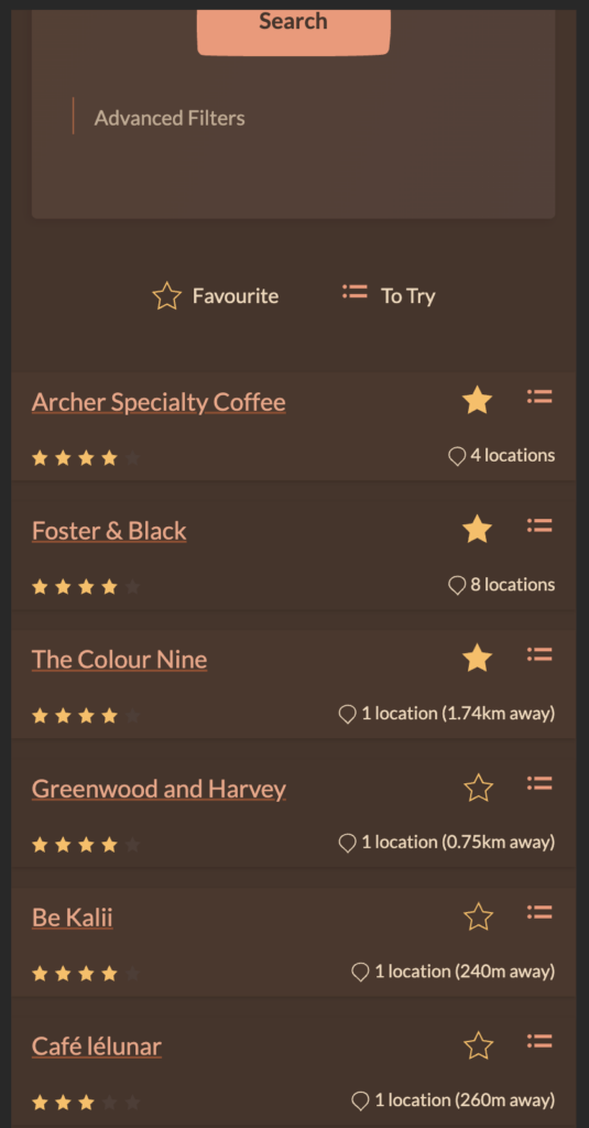
This design attempts to cover that need with a focus on Cafes, search and the ‘To Try’ list (name not decided). This is about searching nearby, in a given area or by name for a cafe then possibly adding it to your To Try list.
I hadn’t considered search by name too much before, but having spoken with other coffee heads in coffee shops I think people will often recommend places and it’d be helpful to add them to your list.
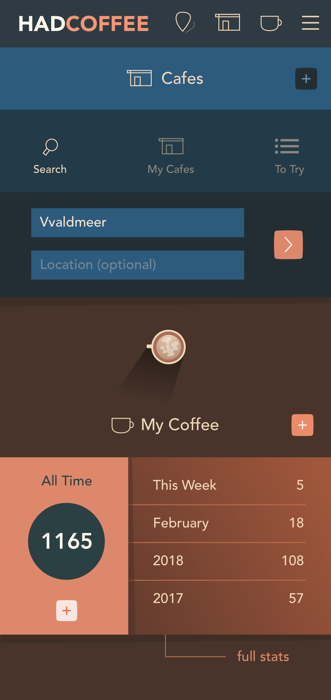
This design shows the cafe search field expanded (it’ll tuck away when one of those other three options are selected). I had to iterate quite a bit to get to this point, but I think it covers the bases I want.
It’s less cluttered and complex than previous revisions; the search, My Cafes and To Try elements are separated and the screen is probably a sensible splash for the main features of the app.
I had hoped to be finished UI design, but I think it was necessary to go back and reconsider what features more people will find useful. I’m not sure there are enough that care just about logging. Hopefully the cafe search is more broadly applicable.
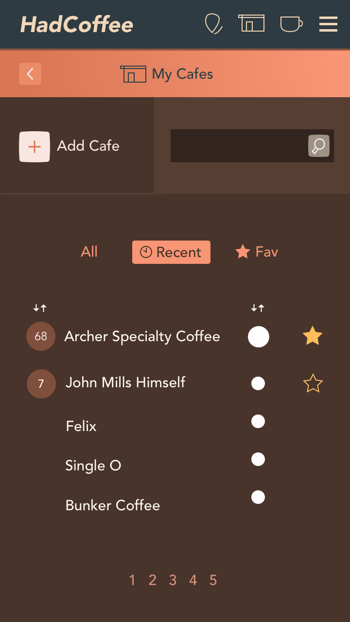
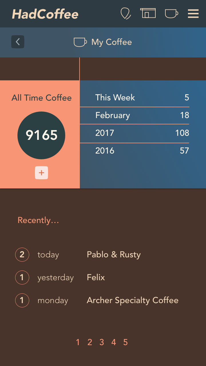
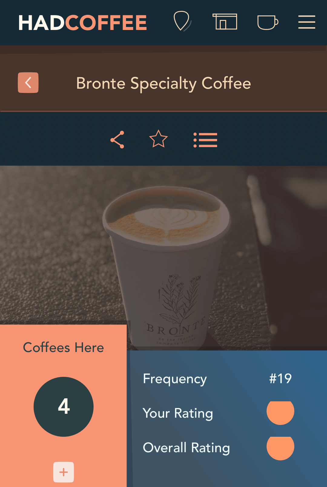
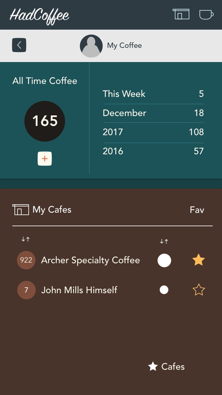
I simplified the coffee and cafes feature by separating them onto different screens for clarity and to reduce the busyness of the interface. This was originally the equivalent of a ‘My Stats’ page with an overview of total coffee consumption, cafe listing and filtering features. That was too much for one mobile screen and users would have missed features lost in the clutter.
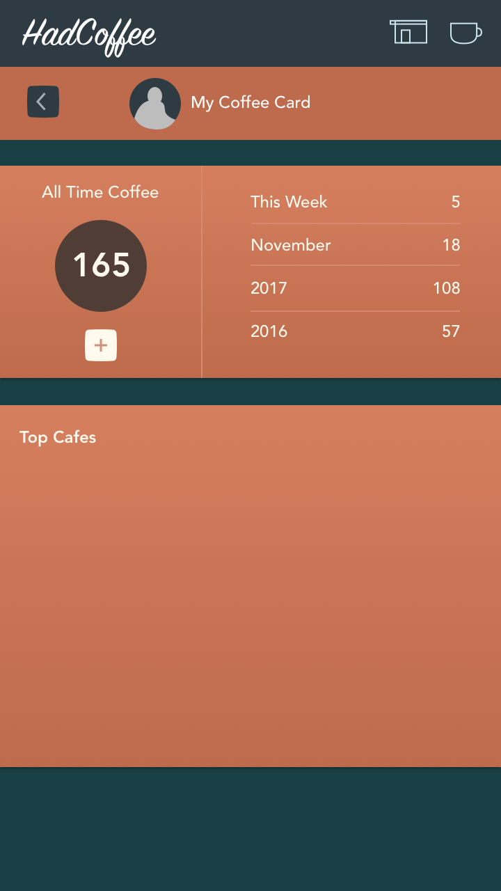
Progress on the ‘My Profile’ screen; a summary of consumption and favourite, recent and most frequent cafes.
I’m trying to get the colour scheme right, with a balance between stereotypical coffee colours, overly saturated oranges that could get to be too much after a while and different hues like the blue. That’s mostly to work out later though.
Some or all of this info will also be visible to a users Followers. I think a social aspect of sharing coffee experiences and being followed will be important for keeping users interested.
My planning for HadCoffee had become slightly derailed by thinking too much about little technical and design issues that may be relevant far into the future.
I’ve refocused on what I can reasonably build for a side project MVP without worrying about down-the-road issues too much. I do still need to keep one eye on development feasibility though, as I don’t want to back myself into a corner too early that stops me from releasing the thing.
I was creating wireframe design for prototyping, but couldn’t help myself with a bit of high fidelity look & feel experimentation. I may end up going directly from screen sketches to a hi-fi prototype although there’s a risk that I’ll have wasted design time on interfaces that don’t get build.
It could be smart to halt the hi-fi work and leave that as an example to myself while I finish screens at low fidelity to test a prototype with some potential users.