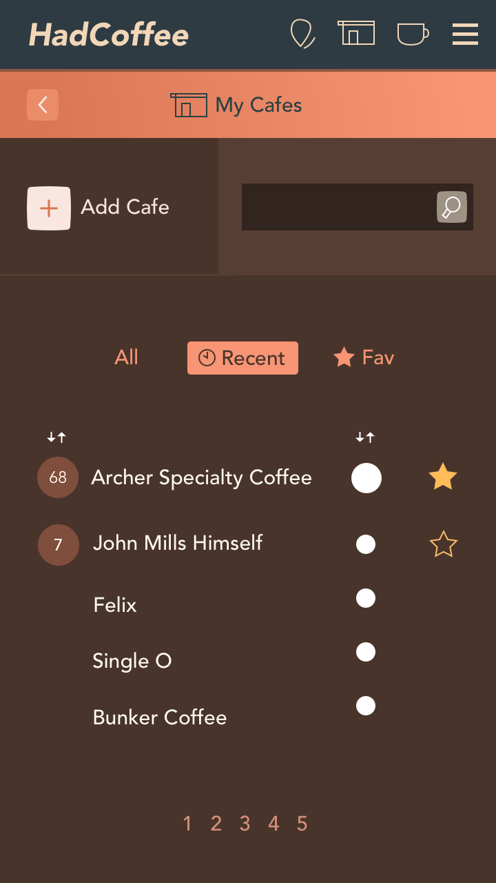
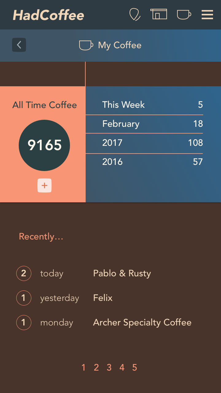
I simplified the coffee and cafes feature by separating them onto different screens for clarity and to reduce the busyness of the interface. This was originally the equivalent of a ‘My Stats’ page with an overview of total coffee consumption, cafe listing and filtering features. That was too much for one mobile screen and users would have missed features lost in the clutter.
This UI design update
- Moved ‘My Cafes’ to its own screen, freeing up ‘My Coffees’ to focus on that
- This gave the Cafes screen scope to have the All, Recent, Fav filters without being lost
- Users can Add and search cafes they’ve visited from here
Visual Changes
- I ditched the ugly grey bar for coloured versions, different for each of the two screens to help differentiate them.
- Brought the section icon into the header for clarity. The user avatar is probably not relevant here
- Tried an orange/peach and blue scheme to avoid everything being variations of the orange/brown hues. I don’t want the app to be too monochromatic
- De-emphasized the ‘back’ buttons in the top bar
- Fleshed out the nav icons a little more (Find Cafes, My Cafes, My Coffee, Hamburger extras)
- To Do: Unify the ‘Add New’ process. Probably bring an ‘Add coffee’ button to near the top of the My Coffee screen to be consistent with the My Cafes screen, and to avoid the awkward null space between the header and the first data card
- Apart from the logo I’m starting to like this look and feel, but need to decide how to unify it with the previous ‘Add Coffee’ screen, which looks good, but is not consistent enough with this flatter design. The long shadows of the other screen will probably be harder to implement, so that might be the deciding factor.