HadCoffee Blog – Page 4 – Development blog for HadCoffee.com

New ‘Home’ screen

Wow, long time no progress. Side projects am I right?

I’m thinking now that the coffee logging and cafe ratings features will probably be secondary to being able to actually find new cafes you want to try. I think fewer people will care about having their personal coffee history available to them than actually being able to find somewhere good to go.

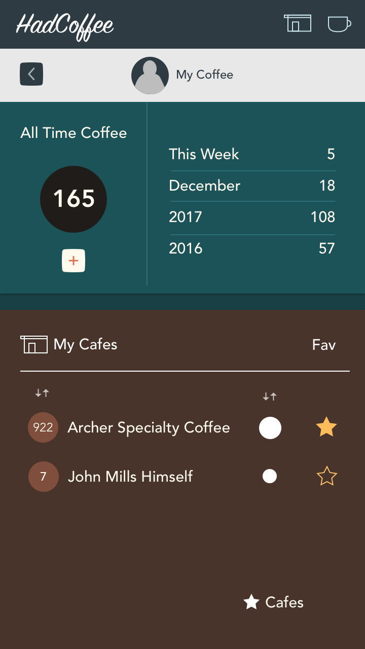
Because of that I didn’t previously have a good ‘home’ screen that leant itself to this usage.

This design attempts to cover that need with a focus on Cafes, search and the ‘To Try’ list (name not decided). This is about searching nearby, in a given area or by name for a cafe then possibly adding it to your To Try list.

I hadn’t considered search by name too much before, but having spoken with other coffee heads in coffee shops I think people will often recommend places and it’d be helpful to add them to your list.


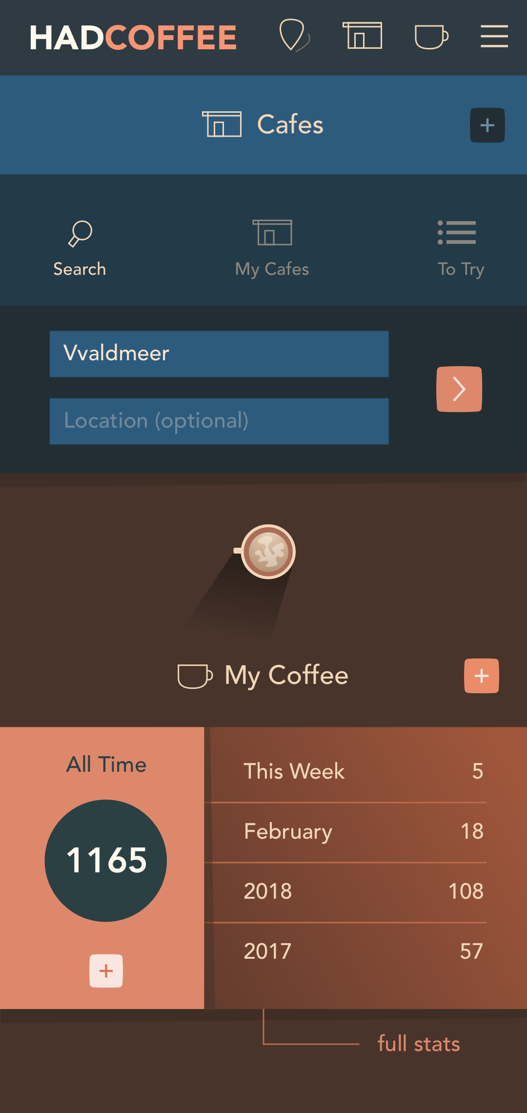
This design shows the cafe search field expanded (it’ll tuck away when one of those other three options are selected). I had to iterate quite a bit to get to this point, but I think it covers the bases I want.

It’s less cluttered and complex than previous revisions; the search, My Cafes and To Try elements are separated and the screen is probably a sensible splash for the main features of the app.

I had hoped to be finished UI design, but I think it was necessary to go back and reconsider what features more people will find useful. I’m not sure there are enough that care just about logging. Hopefully the cafe search is more broadly applicable.

Development

Dev is underway. Frontend template is largely built, but will create components as needed, rather than building a complete styleguide and system up front.

Backend dev has begun too; the Laravel backend started, user auth, and initial work on the process of adding cafes. That’s got a few extra steps than a basic CRUD form because I want to geolocate cafes without the user (or me) having to manually lookup their location.

I’m using HTML5 GeoLocation + Google APIs to reverse geocode the user’s current city for a hint as to which cafe they mean when entering data; then another reverse geocode to get lat/lng and address for the cafe in question.

This will let me do some initial data entry without as much tedious Googling and copy/pasting.

It does mean I need to get a bit diverted on the structuring of the application JS though. I don’t want to go to far building ad-hoc hack scripts that are hard to organize later. I need to workout how my application JS will combine with Vue, Vue Components and future code. May also need to consider how I cache user location or reverse geocode results to reduce API demands.

UI Progress

I simplified the coffee and cafes feature by separating them onto different screens for clarity and to reduce the busyness of the interface. This was originally the equivalent of a ‘My Stats’ page with an overview of total coffee consumption, cafe listing and filtering features. That was too much for one mobile screen and users would have missed features lost in the clutter.

This UI design update

  • Moved ‘My Cafes’ to its own screen, freeing up ‘My Coffees’ to focus on that
  • This gave the Cafes screen scope to have the All, Recent, Fav filters without being lost
  • Users can Add and search cafes they’ve visited from here

Visual Changes

  • I ditched the ugly grey bar for coloured versions, different for each of the two screens to help differentiate them.
  • Brought the section icon into the header for clarity. The user avatar is probably not relevant here
  • Tried an orange/peach and blue scheme to avoid everything being variations of the orange/brown hues. I don’t want the app to be too monochromatic
  • De-emphasized the ‘back’ buttons in the top bar
  • Fleshed out the nav icons a little more (Find Cafes, My Cafes, My Coffee, Hamburger extras)
  • To Do: Unify the ‘Add New’ process. Probably bring an ‘Add coffee’ button to near the top of the My Coffee screen to be consistent with the My Cafes screen, and to avoid the awkward null space between the header and the first data card
  • Apart from the logo I’m starting to like this look and feel, but need to decide how to unify it with the previous ‘Add Coffee’ screen, which looks good, but is not consistent enough with this flatter design. The long shadows of the other screen will probably be harder to implement, so that might be the deciding factor.

My Profile

Progress on the ‘My Profile’ screen; a summary of consumption and favourite, recent and most frequent cafes.

I’m trying to get the colour scheme right, with a balance between stereotypical coffee colours, overly saturated oranges that could get to be too much after a while and different hues like the blue. That’s mostly to work out later though.

Some or all of this info will also be visible to a users Followers. I think a social aspect of sharing coffee experiences and being followed will be important for keeping users interested.

Core Features & Design Concepts

My planning for HadCoffee had become slightly derailed by thinking too much about little technical and design issues that may be relevant far into the future.

I’ve refocused on what I can reasonably build for a side project MVP without worrying about down-the-road issues too much. I do still need to keep one eye on development feasibility though, as I don’t want to back myself into a corner too early that stops me from releasing the thing.

Core Features

  • Logging coffees at cafes
  • Seeing where you’ve been & how much you drink
  • Finding speciality coffee in your area

Design Concepts

I was creating wireframe design for prototyping, but couldn’t help myself with a bit of high fidelity look & feel experimentation. I may end up going directly from screen sketches to a hi-fi prototype although there’s a risk that I’ll have wasted design time on interfaces that don’t get build.

It could be smart to halt the hi-fi work and leave that as an example to myself while I finish screens at low fidelity to test a prototype with some potential users.

Some Look & Feel and Interface Drafts

Concept Sketches


Begun sketching the main screen, with a summary of the user’s stats (almost like a scoreboard) and the interface for adding a coffee to their data.

The interface for adding a coffee should have some fun interactivity, and a minimal, low friction way of giving an approximate rating.

The goal of HadCoffee.com is not about details reviews, so I’ll be building something simpler than a star system. The purpose for recording any rating is to help with recommendations down the track and to be able to report to user’s their favourite as well as most frequently visited coffee shops.

Social

The app will be more fun and useful if there’s some social aspect. I haven’t decided yet if this might include following strangers (ala Twitter), or if it’d be more for personal relationships. I think public profiles could make sense.

There would need to be some privacy controls, such as delaying new ‘Coffees’ for a couple of hours. (Actually live could be useful, but I’d give users the option to delay the post by a 2 / 24 hours).